Branding for Symbol Psychology
B2C
Redesign
Branding

Overview
Symbol commissioned me to redesign their main logo in order to create a brand identity that was consistent with what they wanted to convey to their patients. They began to consider their current logo to be outdated, with a design that did not accurately reflect the values they desired to inspire.
Researching to achive brand goals
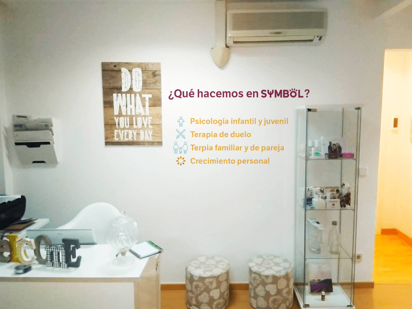
Before starting the design, I analyzed the clinic’s patient profile. Research showed that over 70% of patients are children and teenagers (ages 7-17) with high intellectual capacity, often struggling with stress and identity issues. The remaining patients, typically between 20 and 50 years old, primarily seek therapy to cope with sudden loss.
The brand needed to evoke warmth and trust. Since therapy involves deep emotional vulnerability, it was crucial to create a welcoming environment where patients feel safe to open up.
The design was crafted to balance a sense of closeness and professionalism, using simple illustrations and iconography with a slightly playful tone to appeal to children while keeping a formal aesthetic.


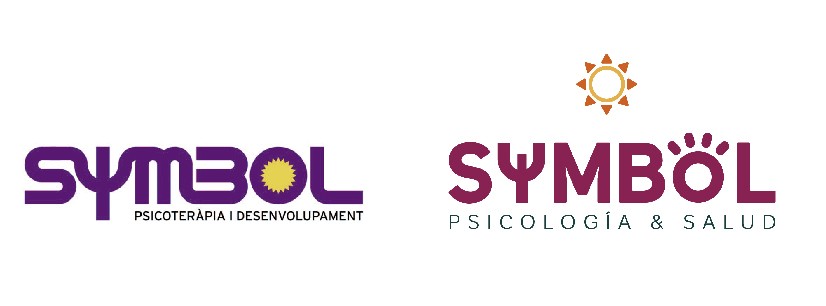
The logo redesign needed to embody the clinic’s core purpose: to be a place of clarity, strength, and transformation for those seeking support. While preserving the essence of the original symbol, its visual language was refined to convey trust without losing warmth.
The Psi (Ψ), a universal symbol of psychology, was subtly integrated, not as a dominant feature, but as a quiet nod to the clinic’s mission of understanding the human mind. The typography reinforces this idea, balancing structure and energy to evoke stability for those embarking on their therapeutic journey.
The sun within the “O” serves as a symbol of awakening, a bright point marking the beginning of a path of self-discovery and balance. More than just a logo, this visual identity reflects the personal journey of each patient.
Brand's colors were chosen by their psychological connotations:
Blue
Associated with serenity, stability, peace and security.
Purple
Associated with fantasy and imagination, often used to describe the subconscious.
Yellow
Represents energy, youth and psychological awakening.
Orange
Oftenly evokes feelings of enthusiasm and creativity, warmth, and optimism.

The pictograms
The elements are specifically designed to be easily associated with therapy processes and to be used in conjunction with psychology posts on their social media profile.

A brain to symbolize the psyche.

A knot with a central point that represents traumas.

A path of dots leading to psychological well-being.

Accented lines that represent the association of ideas in therapy.

The sun as a symbol of happiness.